The competition between online booking agents has never been higher – with two main players competing for share of the market.
In 2018, 63.56 million passengers flew through Australia on 673,600 flights.
Flight Centre and Webjet represent two of the top online booking agents in Australia with a combined 12%+ market share.
From time to time, we conduct these comparisons to keep our skills sharp, but also to help our customers understand how we look at digital properties, what our process is and how each compares to a best practice approach, keeping the customer at the centre of the experience at all times.
Before we look at the individual websites and how they perform, let’s first see how customers are acquired by each brand and how they compare.
In this part of the review, we will look specifically at paid media like PPC, Facebook advertising and homepage design. Our review will look at creativity, engagement and tactics employed by each brand in their effort to acquire new and repeat customers through each channel.
First, let’s look at the overall traffic generated by each brand.
From the chart above, we can see that Webjet drives approximately 25% more traffic to their site as compared to Flight Centre. In a typical month, we see that Webjet attracts anywhere from 2.5-3.6 million visitors to their site while Flight Centre manages only 1.8-2.6 million. When we look at seasonally performance, both businesses see a spike in traffic in Jan however the spike is certainly more pronounced for Webjet by a difference of approximately 400K monthly sessions.
If we first look at the acquisition course, we can clearly see where the vast majority of traffic comes from, as well as where there is a large gap – potentially indicating a valuable source of traffic and revenue.
Comparing both businesses, we see that 80% of the traffic comes from mobile sources with approximately 26% of total traffic coming direct to the website and not through a third-party like a social channel or search engine.
The comparison clearly shows that both businesses get about 10-13% of their overall traffic from paid sources, but both brands see next to no traffic coming from social channels.
For the purposes of this review, let’s focus on the two most critical paid channels; paid search (Adwords) and social media. Each of these channels represents both an opportunity and cost centre for acquiring new customers into the website conversion funnel.
Given that we are missing the CLV (Customer Lifetime Value) and total production costs of ads, we are not going to be able to compare the overall ROI for each of these brands, but what we can look at is the consumer personas, social media strategy and paid media strategy for each business and compare them.
Let’s dive into the paid media first – SEM ads.
Flight Centre
Over the past 12 months we have seen a significant increase in the paid search driving an additional 220K site visits per month, but that traffic comes at a whopping ~$787,000 per month across all of their key terms.
A review of the top keywords targeted in their campaigns, we see a small proportion spent on brand key terms like Flight Centre, but the bulk of the spend is spent on the keyword ‘flights’ with the destination used as a localisation term. Surprisingly, the destination URL is rarely a page dedicated to the localisation campaign, rather traffic is sent to the homepage of the site.
We believe that this is a lost opportunity to get a better page score from Google to ultimately lower the cost of paid media, but also the chance to drive personalised content to the consumer.
If we look at the targeting of the ads places, we see a skew towards men by 10% with a relatively equal split of spend targeting 18-24, 25-34 and 35-44 year-olds.
I am a little surprised by the skew towards men as we typically see women as holding the purse strings when it comes to discretionary purchases like travel and accommodation.
Webjet
If we look at the paid performance for Webjet, we see a similar spike in paid media spend around March however the proportion of traffic generated is larger. We see an overall growth from 50K visitors per month to 125K visitors per month over the past few months. This 250% increase comes at a cost of $90K per month.
This indicates that Webjet is getting far better bang for their buck. Part of that advantage come from going beyond just brand and localisation, with the use of key phrase terms like ‘Sydney to Melbourne Flights’. We also see that Webjet is not always concerned about bidding for first position in their ad placement. This means Webjet can control the price for top spot with their own bidding strategy and still get better traction on their ad clicks.
If we look at the demographic targeting, we see some interesting differences. Webjet is more balanced in their targeting by gender but more importantly, they skew their spend even more to slightly older markets who likely have more disposable income (25-34, 35-44 and 45-54 year-olds).
So, who does it better?
Well, if we look at bang for your buck, Webjet is doing a much better job. They are generating more traffic for each dollar they spend and controlling the cost of a top position ad. In addition, their demographic targeting seems more effective, targeting a balance of men and women but also concentrating on ages that are more likely to have the disposable income needed to convert.
This one goes to Webjet.
Social Media
The social space is an interesting one. It’s the place where consumers choose to engage with brands, not the other way around. In this space, consumers choose to share their experiences (good and bad) with each other, giving brands the opportunity to create loyal online communities.
In this space, converting customers into fierce brand advocates can lead to better and more effective sales because the messaging is not coming from a brand where credibility is always in question, but rather from family and friends, who are highly trustworthy.
While brands can buy ads on social media platforms, it is the community content that is the most interesting. Ads are tactical but time and budget-dependent. Once the campaign is over, the content is lost forever. Content in the brand timeline stays but can still be promoted in a similar way to ads.
Flight Centre – Facebook
Flight Centre takes an interesting approach to social media. They use a balance of staff specialists, informational (including events) posts and tactical or transactional posts.
Staff Specialists
Flight Centre has chosen to use their staff as brand ambassadors and knowledge leaders. Since Flight Centres staff can work flexibly, they are now being encouraged to share their travel experiences for the brand, becoming their new ambassadors.
This new take not only shows the brand in a new, more youthful light, but it also means that social media content is being generated by ‘experts’ in the travel business for little to no money. Given the change in paid media demographic targeting, this makes a lot of sense.
Informational
Travel nights, information sessions, destination articles, planning guides etc. These are all part of the second content pillar from Flight Centre. By giving away as much content as possible to inform current and future customers on specifics of travel, flights, destinations etc. they add value to the consumer beyond a simple transaction.
Tactical / Transactional
These are what we would typically see in ATL marketing. These are more traditional posts showcasing sales, promotions, discounts, special offers, tour discounts or any other bits of information promoting specifically a transaction. Customers are taken to specific transactional pages on the Flight Centre website to continue the purchase process.
Overall the social experience for Flight Centre has taken an interesting twist recently. By purposefully targeting a more youthful market, leveraging their own staff as brand ambassadors to start to build a new, loyal client base who is driven by the idea of experiences – not just cost.
Webjet – Facebook
Webjet by contrast has a more traditional take on social media. Their approach is far more tactical, targeting destinations, families and the discounts they can get for their travels. Of course, there is a more traditional localisation aspect to topical content like the Grand Final as well.
Webjet’s consumer targeting for their paid media is for an older demographic who are more likely to have children. It makes sense that their social media marketing would follow the same approach, focussing on family destination with group stays and discounts.
I would say that this is a little underwhelming. Yes, there is some aspirational content here, but there is so much more that a brand can do to give their customers a better sense of the destinations. Webjet would, in fact, take a page out of Flight Centre’s playbook and showcase their employees travels to these family destinations as well.
So, who does it better?
I have to say, Flight Centre’s new approach to content it the real winner here. I would say that over time, Flight Centre should start to see better traction in their social media website traffic referrals. Perhaps experimenting a little more with content formatting including galleries and video might help to push the point a little more with their audience. If they know in advance of their staff travels, giving them one or more Go-Pro cameras to take with them would help to build a larger, more immersive content repository that could drive more engagement with their youthful audience.
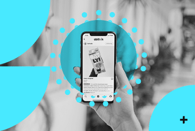
Flight Centre – Instagram
Carrying on from their Facebook presence, Flight Centre has put a lot of thought into their Instagram page – and with 128K followers – it shows. With Instagram stories for specific destinations, fantastic destination guides using IGTV and a strong hashtag strategy, Flight Centre shows brands how it should be done.
With Millennials now being their primary target, they are using Instagram to great effect.
Webjet – Instagram
Webjet on the other has a more traditional Instagram feed filled with beautiful photos, but little to no video content and no IGTV content. Instagram stories are limited to hashtags and their own hashtag strategy is poorly defined.
This certainly explains why Webjet only has 14K followers. Yes, their content is beautiful but that isn’t enough to make the page interesting or engaging.
So, who does it best?
Flight Centre – hands down.
So, after reviewing the paid acquisition strategies for both companies, Flight Centre is doing it best. While their Adwords would certainly use a lot of optimization to drive more traffic as well as drive the over costs down, their approach to social media is the true winner.
Now let’s look at the website UX. It’s critical that the website we present to consumers are easy to read, navigate and interact with; otherwise we’ve wasted all this time driving traffic.
Let’s focus on the desktop experience to start our journey…
Homepage
So, like most visitors, we start at the beginning by looking at the homepages for each of our brands. Here I am going to give my first impression on aesthetics and UX (user experience) and see which of our brands is doing it better.
Aesthetics
On average we have less than two seconds to make an impression on our customers. For that reason, aesthetics can have material impact on site conversion and customer trust. Is the site beautiful? Is it engaging? Is it clear we are on the right site and does the design make the customer believe that they can trust the brand?
For our analysis we are going to focus on what consumers see on page load – above “the fold” (what we see without having to scroll down the page). This is where websites do most of their heaving lifting, setting the groundwork for conversion on their website. Remember, this is not a comprehensive audit, rather a view of the primary purpose for each businesses – selling airline tickets.
Flight Centre
My first impressions are that this site has been well designed by a team who understands whitespace, typography and use of imagery. The use of the entire width of the browser including both the header and the main carousel image provides the user with a clean, engaging experience. The large and immersive images bring you closer to the content, making you feel drawn to the destination being promoted.
The contrast of the search tool in white against the colourful and bright background means it stands out proud, drawing your attention and makes you focus on the most important part of the site – the booking of a flight.
Webjet
Webjet hasn’t really changed much over the years. The UI is frankly looking a little stale. It’s fixed width design, cluttered navigation and low-contrast search tool are certainly usable, but don’t really make the user excited.
If I focus on the content behind the search tool, one could assume that there is a carousel there. There is a button on the bottom right corner of the image which suggest a ‘next slide’ button – but we would be wrong. In fact, there is no carousel at all.
To me this is a significant oversight. This is prime realestate that is being used to promote a birthday sale with significant discounts to the customer. Not making the entire header image clickable means they are losing clicks to the promotion and therefore potentially losing sales in the process.
Mobile
If we look at mobile, we can see the same issues playing out. Webjet has chosen to drop any imagery to present only the search tool above the fold however, Flight Centre continues beautiful imagery and typography to make the experience more immersive while retaining focus on the primary purpose of the site – to buy airline tickets.
So, who wins?
If we look at the use of modern design techniques, big, engaging images and the use of colour and typography to create contrast, the winner is Flight Centre – hands down.
Geolocation Services
It’s interesting that geo-location is not requested on the Webjet site. You would think that with the availability of location data to simplify or reduce customer input would be valuable to a brand as it reduces the steps to completion and automatically completes some of the expected user journey – like preselecting the departure location in the search form.
Flight Centre, on the other hand does enable geo-location, but for some strange reason the geo-location is used to define your locations for packages, destination offers etc that appear below the fold and is not used in the search form. This is a very strange choice. Setting the default location in the search tool would likely remove a click by the consumer and simplify the path to purchase.
Now I know, in Melbourne we have two airports but Avalon accounts for only 1.6% of annual air traffic, so defaulting to Tullamarine is a better UX option.
What is worse in this case, Sydney is chosen by default, so if after you have just given permission for geo-location, the location selected is wrong. As a user, I find this very strange – instead of selecting my destination, I now find myself having to correct a data error.
OK, now let’s dive into the search tool
Continuing with the same approach, let’s look at the booking tool from the viewpoint of desktop devices first, then we can move to mobile space.
As I pointed out earlier, on first view, the Flight Centre tool stands out more, drawing in your attention right away. But let’s look beyond aesthetics and now look at the functionality of this tool to see how usable it is.
Flight Centre
The search tool on the homepage represents the most valuable space on each site so making sure it is working across your core offerings is critical to optimising the number of searches. Cleverly, Flight Centre takes this into consideration and uses the top row to allow the consumer to search from its three core offerings: flights, hotels and cruises – treated like a pseudo-tab design.
For our test we are setting the criteria to a return journey, from Melbourne Tulla to Brisbane, economy seat using the same dates for departure and return.
Of course, our first step is to fix the odd behaviour of defaulting to Sydney airport to Melbourne Tulla.
When a form field gets focus, the entire site scrolls so the field is at the top of the screen. To me this is a little jarring and unexpected. I don’t expect fields to disappear as I make my way down a form, nor do I expect the site to scroll itself. This seems like unnecessary behaviour.
When entering a departing location or destination, a drop-down list appears that clearly shows the airport code and location. The typography is not cluttered making it easy to read and to select from.
Selecting departing and return dates is simple. The use of modals ensures that the desktop and mobile presence has consistency, focusing your attention on the task at hand.
The same approach is taken for selecting the number of passengers and seat class. Interesting that Flight Centre combines these selections into a single modal as opposed to Webjet who leave them as separate form fields to engage with.
Looking at the mobile experience, we see that the presentation and use of the search tool is exactly the same as the desktop experience. This consistency means that the UX and UI teams gave a lot of thought to the usability of the search form, took a mobile-first approach to the design of the site, while ensuring consistency on all platforms.
Webjet
Utilitarian and simple. Webjet focuses the user on a single task – booking flights. The search tool does not integrate any other revenue streams. This does keep the search form singularly focused, but it also limits the value that the homepage form real estate could bring to the brand. As stated before, this is highly valuable space and to not make your core offerings available seems like a potentially expensive oversight.
Searching for a departure or arrivals location isn’t as clean as Flight Centre. Location name are presented first with the airport code in brackets. While there is nothing specifically wrong with this approach, the Flight Centre approach lends itself to better use of whitespace, making the content legible from a distance – making it easier for couples or small groups to use the site together.
What I do like however, is that once you select your departing and returning cities and move onto selecting your dates, you not only get an interactive calendar, you get to see the cheapest prices for each day, colour coded so you can always find the best price for each day. Information that can be valuable for small businesses, families or individuals on a tight budget.
Thankfully the mobile experience is just as consistent. Same functionality, same design and same user experience. Once again continuity across devices is appreciated by users.
So, who wins?
Both sites choose to focus of the search tool on their mobile experience, but Flight Centre also continues their effective branding and use of imagery by enabling their carousel in the header of their mobile site. This allows them to effectively promote offers and showcase destinations to consumers on all platforms, not just desktops. In fact, the lack of colour, imagery offers or any other branding on their homepage make the Webjet experience a little lacklustre.
I will say that the inclusion of pricing in the date range selection is a great addition and since it is available of all devices, it gives a nice consistent experience.
When deciding a winner, I had to consider branding, usability, functionality and consistency. In this case, I have to give it to Flight Centre.
So that’s 2-0 for Flight Centre.
Search Results
So, the search criteria used was the same across both site and devices. From Melbourne to Brisbane from August 30 to September 6, economy flight, travelling on my own in economy. This should give me the largest number of search results across both platforms. How both companies choose to display the number of search results and how we can then engage with the results is what I am most interested in.
Flight Centre
Once again, we can see that Flight Centre has spent a lot of time considering how to present flight options to the user. When we consider that flights are leaving leaving all day, across multiple airlines with various fare options, there are literally hundreds of options to choose from.
By collapsing all flights and only presenting the most critical information, consumers are able to decide on their choice of airline, time of departure and arrival and get an estimate on the lowest cost for that flight.
By using terms like ‘from’ in the pricing, consumers are made aware that there will likely be further pricing options to choose from, but by only presenting the minimum options to customers, navigating the list of flights available becomes far simpler.
On the left side of the page, the filter options are exposed and are quite useful. Something as simple as choosing from morning, afternoon or evening can have positive impact on the results presented, reducing the complexity and volume of search results, further simplifying the UI and purchase process.
If you want more information on any flight, clicking it will expand to reveal the discount fare options available. Not only does this save space, it allows for Flight Centre to present the benefits of each discount fare option in a clear and concise fashion; ending with the highlighting of the price point. The result are not presented as an accordion, so you can open multiple flights and compare the options and prices available.
Once you are done selecting your departure and return flights, you a pushed into the checkout flow which starts with the confirmation of your flight choices.
The experience on mobile is a direct replica of the desktop experience. Once again the experience is clan and intuitive with the flight options being presented in a clean and legible fashion.
WebJet
In sharp contrast to Flight Centre, the search results for WebJet are a bit of a mess. By trying to show customers every flight available at every price point and discount, Webjet ultimately presented to customers with a massive table of options that in some cases can cause the site to scroll sideways.
Webjet only provides pricing for flights with seats available in each discount code and if you hover over each price, you are provided with additional information including flight times, the type of plane as well as any amenities that will be provided on the flight like meals, wi-fi, power outlets etc. Certainly nice information in advance of any journey so you can prepare yourself; especially if you are a business traveler needing to charge your phone or do some work.
Filtering your search results is buried in the top left of the page and look like either an afterthought primarily because of its placement within the page layout. I wouldn’t be surprised to see a lot of people miss this feature on the search results pace.
Filtering options are pretty basic as you would expect but it would be nice to restrict the time of day as this page can become quite lengthy is there are a lot of options available; making excessive scrolling something customers will be forced to deal with.
Of course. Once you’ve selected your flights, you are presented with a confirmation page.
What is interesting is the mobile experience for Webjet is a much better experience and in many ways mimics the experience of Flight Centre. Flights are presented in a much more compact fashion, limiting the scrolling necessary to find the flight that best suits your needs. Clicking on any of the flights reveals the flight discount options, allowing you to effectively choose a price. Because you can select anywhere on each row to select a seat discount, making a selection is efficient and it is clear what you are choosing.
Once you have selected your flights, you are presented with a clear checkout page to get you started in the checkout process.
So, who wins?
I think we can all agree that the presentation of search results on the Webjet desktop experience is the big let-down in this comparison. In fact, if you take a look at their mobile experience, the fact that they replicate the Flight Centre experience suggests that they would likely agree with my assessment.
By simplifying the presentation of flights available in a logical order, the process more closely resembles a consumer’s likely thought process. What airline do I want to fly? What time do I want to leave? What is the price of the seat?
This one is not even close. Although Webjet made their mobile site simple and effective, their desktop experience lets them down, giving the win to Flight Centre.
Flight Centre is now up 3-0.
So, what is the checkout like?
Now we get to the pointy end of the process – the checkout process. It is the point in any ecommerce site where the most leakage happens. This can be for a range of reasons including too many upsells and cross-sells, customers getting lost in all of the options available, an overwhelming number of pages to complete and finally – hidden or misleading user interaction requirements.
For this section, I am going to show you full page screenshots. It’s important to understand the full context of each page as we progress through the checkout.
Flight Centre
Step 1 – Order Confirmation
Flight Centre keeps each of its steps simple and easy to understand. First is the order confirmation page which shows you your flight selections and simply asks if you want or need extra baggage.
Step 2 – Passenger Information
A simple page asking for my contact details. If I had an account, this content would be largely filled in for me, but for this exercise, I wanted to take the perspective of a guest purchase. Of course, if there are additional travellers, this page would also include those form fields as well.
Once again, simple, clear and easy to complete. It is also here where I have the option to save my details for next time as well as being offered the option of subscribing for future marketing. These are unobtrusive checkboxes giving me the choice to select them if I wish.
Step 3 – Extras
This is the dreaded up-sell page. I’m asked if I want to pay extra in case the price of the flight drops. For my flight, that is the only part of this offer that has any bearing on my trip. I am not flying internationally and I’m not flying domestically with a passport. It seems strange that Flight Centre has not built in some smarts to only show the sections that are relevant to me. It would help to further clean up the page design and reduce the perception of how much time it will take to complete the checkout.
As for the travel insurance, this is a little sneaky. Taking pride of place is the ability to add domestic travel insurance for $15. That’s fine, but the ‘no thanks’ and the button to proceed without insurance has been purposefully blended into the page design, making is harder to see and I’m sure some people will either miss it, making the page throw an error, or may buy the insurance not seeing the option to decline.
Bad form as far as I’m concerned. Be fully transparent with your customers. I know you make massive profits from this up-sell, but no need to be dirty about it.
Step 4 – Payment
By default, the assumption is that you want to pay by credit card but there are plenty of option available if you prefer a different method. A simple, easy page letting you pay on the left with your order summary on the right.
The mobile experience is much the same. Four steps to complete the transaction, virtually the same as the desktop experience. Continuity across platforms is definitely there and it is a simple and effective checkout. I would have like to see a more refined experience on mobile, perhaps with an accordion design which would remove the need for so many pages.
Webjet
Step 1 – Order Confirmation & Up-sells
I’m of two minds about this page. At first glance this page looks busy and a little overwhelming, filled with up-sells and options for hotels, car rentals and travel insurance. It looks a little confusing but, it does ask you everything in a single page, so it reduces the number of pages I the checkout from four (in the case of Flight Centre) to two.
Much like Flight Centre, I am really disappointed that the ability to proceed in the checkout is contingent on the insurance and that the ‘no’ option is once again the smallest and least obvious parts of the page design.
Step 2 – Payment
We are presented with a page that looks long and clunky. But this is more about the design than the amount of information being requested. If you have an account, this information can also be pre-populated as well. If the design of this page was more thoughtfully presented, I think the perception would be more in line with the actual work required.
On mobile, we are presented with a very different checkout experience. First, our order confirmation page (left) is designed with an accordion style, meaning only one section can be open at a time. The page shows the flights we have selected but the up-sells for hotel and car hire are collapsed by default. This is in stark contrast to the desktop experience where the page presentation is cluttered and obtrusive.
On the payment page (right) once again we are presented with an accordion design. There are five sections to complete, so you can only complete one at a time. The page presentation is clean although the branding is fairly old-school.
So, who wins?
This is a harder decision. Flight Centre has a clean multi-step design where each step has a clear purpose. The mobile experience is not as nicely designed as the rest of the site, but the checkout is fairly quick and easy.
With Webjet, the desktop experience is lacking in design and style making the pages a little clunky, but on mobile, the experience is simpler and easier to engage with.
Both sites hide options to try to get consumers to buy insurance they may or may not need and to me that is bad business practice. I understand that these are high margin up-sells for the companies, but purposely designing the ‘no’ options into the background is not what a business should be doing.
I’m not entirely happy with either checkout experience on desktop. On mobile however, I think Webjet clearly has done a better job. While the design itself needs an update/upgrade, the functionality and usability is much better – making you wonder why not replicate this experience on desktop.
Flight Centre is still up 3-1, but Webjet gets on the board.
Other issues
Both Flight Centre and Webjet have a session timer. Both are set to 30 mins and hold ticket prices in place at the selected price until the time runs out. Webjet clearly shows their timer in the top-right corner of the page showing you the time remaining in your order.
Flight Centre, on the other hand, does not show a timer. Instead, your session can time out without warning, breaking the user experience and forcing a page refresh. If you happen to be in the checkout at the time, you will have to start all over again.
Flight Centre should make their session duration clearer so customers move through the checkout process faster and to be more transparent to customers that if their session expires, the they may lose the pricing of the seats they have been tentatively booked. If used properly, this could be used as part of a purchase incentive tactic. It would be interesting to see the effect on checkout conversions.
So, who wins?
Clearly Webjet for showing the consumer that there is a time limit to guaranteeing the price and seat for the booking. Webjet’s transparency is likely to help drive more conversions as time runs down and Flight Centre must address potential customer complaints as timeouts hit customers looking to book their seats.
Clearly Webjet wins but still trails Flight Centre 3-2.
Overall verdict
The focus of this comparison piece was to look at how easily a customer can search for a domestic flight and book it. We considered the branding, the creativity of the site, the usability of the search tool and the complexity of the checkout process.
To test the site performance, we conducted a search and completed a booking for a flight from Melbourne to Brisbane for the same days, same flight and same options.
Homepage
Flight Centre has a more modern design which is more inviting, inspiring customers by showcasing not only deals, but destinations as well. The use of big images, bright colours, larger typography and whitespace makes the homepage inviting to all users.
While both sites focus on the search tool as its primary functionality, its Flight Centre that has better contrast, making the search stand out more on the page. The search too lets you search for more than just a flight and makes the search experience more engaging.
Flight Search
Both search tools offer good performance, but the Flight Centre tool allows you to search for more than just flights. Its design makes it easier to read and the usability across devices is consistent. The only feature I wish it had was the incorporation of flight costs into the calendar as Webjet has.
Search Results
By condensing the search results to their bare essentials, the Flight Centre search results are easier to read both from a distance and when try to get more information on price and the benefits of each discount price. The layout was unobtrusive and the filters, while simple, offer tangible results for refining search.
Mobile consistency also goes to Flight Centre. I think it’s fair to say that Flight Centre has mostly taken a mobile first approach to their design.
Checkout Process
Flight Centre has a four-page multi-step process. Its design suggests that the UI was designed to give the customer short tasks to complete the checkout process. Webjet simplifies their process into two pages, but their design is more cluttered and harder to read. In both cases each company has purposely blended customer choices for insurance into the background of the design in a somewhat underhanded attempted to increase revenue though confused users.
For mobile, there is a substantive difference with Webjet using accordion designs to simplify the presentation and interaction with sections of their checkout process. This reduces the checkout to two pages and makes the experience simple and easy to complete.
Other items
The use of session time to reserve flight seats is common practice. Each user has 30 minutes to complete the checkout process in order to keep the flight selections they have made. Flight Centre does not present this information to consumers so when the session times out, consumers are presented with a requirement to refresh the page or start the search again, in both cases, there is not guarantee that the flights originally selected will still be available.
Final Results
Overall, the final tally has Flight Centre winning 3-2 in what became a close battle with Webjet.
We are digital marketing experts
SCALE YOUR SALES WITHHIGH-CALIBRE DIGITAL CAMPAIGNS
 From the chart above, we can see that Webjet drives approximately 25% more traffic to their site as compared to Flight Centre. In a typical month, we see that Webjet attracts anywhere from 2.5-3.6 million visitors to their site while Flight Centre manages only 1.8-2.6 million. When we look at seasonally performance, both businesses see a spike in traffic in Jan however the spike is certainly more pronounced for Webjet by a difference of approximately 400K monthly sessions.
 If we first look at the acquisition course, we can clearly see where the vast majority of traffic comes from, as well as where there is a large gap – potentially indicating a valuable source of traffic and revenue.
Comparing both businesses, we see that 80% of the traffic comes from mobile sources with approximately 26% of total traffic coming direct to the website and not through a third-party like a social channel or search engine.
The comparison clearly shows that both businesses get about 10-13% of their overall traffic from paid sources, but both brands see next to no traffic coming from social channels.
For the purposes of this review, let’s focus on the two most critical paid channels; paid search (Adwords) and social media. Each of these channels represents both an opportunity and cost centre for acquiring new customers into the website conversion funnel.
Given that we are missing the CLV (Customer Lifetime Value) and total production costs of ads, we are not going to be able to compare the overall ROI for each of these brands, but what we can look at is the consumer personas, social media strategy and paid media strategy for each business and compare them.
If we first look at the acquisition course, we can clearly see where the vast majority of traffic comes from, as well as where there is a large gap – potentially indicating a valuable source of traffic and revenue.
Comparing both businesses, we see that 80% of the traffic comes from mobile sources with approximately 26% of total traffic coming direct to the website and not through a third-party like a social channel or search engine.
The comparison clearly shows that both businesses get about 10-13% of their overall traffic from paid sources, but both brands see next to no traffic coming from social channels.
For the purposes of this review, let’s focus on the two most critical paid channels; paid search (Adwords) and social media. Each of these channels represents both an opportunity and cost centre for acquiring new customers into the website conversion funnel.
Given that we are missing the CLV (Customer Lifetime Value) and total production costs of ads, we are not going to be able to compare the overall ROI for each of these brands, but what we can look at is the consumer personas, social media strategy and paid media strategy for each business and compare them.
 Over the past 12 months we have seen a significant increase in the paid search driving an additional 220K site visits per month, but that traffic comes at a whopping ~$787,000 per month across all of their key terms.
A review of the top keywords targeted in their campaigns, we see a small proportion spent on brand key terms like Flight Centre, but the bulk of the spend is spent on the keyword ‘flights’ with the destination used as a localisation term. Surprisingly, the destination URL is rarely a page dedicated to the localisation campaign, rather traffic is sent to the homepage of the site.
We believe that this is a lost opportunity to get a better page score from Google to ultimately lower the cost of paid media, but also the chance to drive personalised content to the consumer.
Over the past 12 months we have seen a significant increase in the paid search driving an additional 220K site visits per month, but that traffic comes at a whopping ~$787,000 per month across all of their key terms.
A review of the top keywords targeted in their campaigns, we see a small proportion spent on brand key terms like Flight Centre, but the bulk of the spend is spent on the keyword ‘flights’ with the destination used as a localisation term. Surprisingly, the destination URL is rarely a page dedicated to the localisation campaign, rather traffic is sent to the homepage of the site.
We believe that this is a lost opportunity to get a better page score from Google to ultimately lower the cost of paid media, but also the chance to drive personalised content to the consumer.
 If we look at the targeting of the ads places, we see a skew towards men by 10% with a relatively equal split of spend targeting 18-24, 25-34 and 35-44 year-olds.
I am a little surprised by the skew towards men as we typically see women as holding the purse strings when it comes to discretionary purchases like travel and accommodation.
If we look at the targeting of the ads places, we see a skew towards men by 10% with a relatively equal split of spend targeting 18-24, 25-34 and 35-44 year-olds.
I am a little surprised by the skew towards men as we typically see women as holding the purse strings when it comes to discretionary purchases like travel and accommodation.
 If we look at the paid performance for Webjet, we see a similar spike in paid media spend around March however the proportion of traffic generated is larger. We see an overall growth from 50K visitors per month to 125K visitors per month over the past few months. This 250% increase comes at a cost of $90K per month.
This indicates that Webjet is getting far better bang for their buck. Part of that advantage come from going beyond just brand and localisation, with the use of key phrase terms like ‘Sydney to Melbourne Flights’. We also see that Webjet is not always concerned about bidding for first position in their ad placement. This means Webjet can control the price for top spot with their own bidding strategy and still get better traction on their ad clicks.
If we look at the paid performance for Webjet, we see a similar spike in paid media spend around March however the proportion of traffic generated is larger. We see an overall growth from 50K visitors per month to 125K visitors per month over the past few months. This 250% increase comes at a cost of $90K per month.
This indicates that Webjet is getting far better bang for their buck. Part of that advantage come from going beyond just brand and localisation, with the use of key phrase terms like ‘Sydney to Melbourne Flights’. We also see that Webjet is not always concerned about bidding for first position in their ad placement. This means Webjet can control the price for top spot with their own bidding strategy and still get better traction on their ad clicks.
 If we look at the demographic targeting, we see some interesting differences. Webjet is more balanced in their targeting by gender but more importantly, they skew their spend even more to slightly older markets who likely have more disposable income (25-34, 35-44 and 45-54 year-olds).
So, who does it better?
Well, if we look at bang for your buck, Webjet is doing a much better job. They are generating more traffic for each dollar they spend and controlling the cost of a top position ad. In addition, their demographic targeting seems more effective, targeting a balance of men and women but also concentrating on ages that are more likely to have the disposable income needed to convert.
This one goes to Webjet.
If we look at the demographic targeting, we see some interesting differences. Webjet is more balanced in their targeting by gender but more importantly, they skew their spend even more to slightly older markets who likely have more disposable income (25-34, 35-44 and 45-54 year-olds).
So, who does it better?
Well, if we look at bang for your buck, Webjet is doing a much better job. They are generating more traffic for each dollar they spend and controlling the cost of a top position ad. In addition, their demographic targeting seems more effective, targeting a balance of men and women but also concentrating on ages that are more likely to have the disposable income needed to convert.
This one goes to Webjet.


 Carrying on from their Facebook presence, Flight Centre has put a lot of thought into their Instagram page – and with 128K followers – it shows. With Instagram stories for specific destinations, fantastic destination guides using IGTV and a strong hashtag strategy, Flight Centre shows brands how it should be done.
With Millennials now being their primary target, they are using Instagram to great effect.
Carrying on from their Facebook presence, Flight Centre has put a lot of thought into their Instagram page – and with 128K followers – it shows. With Instagram stories for specific destinations, fantastic destination guides using IGTV and a strong hashtag strategy, Flight Centre shows brands how it should be done.
With Millennials now being their primary target, they are using Instagram to great effect.
 Webjet on the other has a more traditional Instagram feed filled with beautiful photos, but little to no video content and no IGTV content. Instagram stories are limited to hashtags and their own hashtag strategy is poorly defined.
This certainly explains why Webjet only has 14K followers. Yes, their content is beautiful but that isn’t enough to make the page interesting or engaging.
So, who does it best?
Flight Centre – hands down.
So, after reviewing the paid acquisition strategies for both companies, Flight Centre is doing it best. While their Adwords would certainly use a lot of optimization to drive more traffic as well as drive the over costs down, their approach to social media is the true winner.
Now let’s look at the website UX. It’s critical that the website we present to consumers are easy to read, navigate and interact with; otherwise we’ve wasted all this time driving traffic.
Let’s focus on the desktop experience to start our journey…
Webjet on the other has a more traditional Instagram feed filled with beautiful photos, but little to no video content and no IGTV content. Instagram stories are limited to hashtags and their own hashtag strategy is poorly defined.
This certainly explains why Webjet only has 14K followers. Yes, their content is beautiful but that isn’t enough to make the page interesting or engaging.
So, who does it best?
Flight Centre – hands down.
So, after reviewing the paid acquisition strategies for both companies, Flight Centre is doing it best. While their Adwords would certainly use a lot of optimization to drive more traffic as well as drive the over costs down, their approach to social media is the true winner.
Now let’s look at the website UX. It’s critical that the website we present to consumers are easy to read, navigate and interact with; otherwise we’ve wasted all this time driving traffic.
Let’s focus on the desktop experience to start our journey…


 When entering a departing location or destination, a drop-down list appears that clearly shows the airport code and location. The typography is not cluttered making it easy to read and to select from.
 Selecting departing and return dates is simple. The use of modals ensures that the desktop and mobile presence has consistency, focusing your attention on the task at hand.
 The same approach is taken for selecting the number of passengers and seat class. Interesting that Flight Centre combines these selections into a single modal as opposed to Webjet who leave them as separate form fields to engage with.
 Looking at the mobile experience, we see that the presentation and use of the search tool is exactly the same as the desktop experience. This consistency means that the UX and UI teams gave a lot of thought to the usability of the search form, took a mobile-first approach to the design of the site, while ensuring consistency on all platforms.
 Searching for a departure or arrivals location isn’t as clean as Flight Centre. Location name are presented first with the airport code in brackets. While there is nothing specifically wrong with this approach, the Flight Centre approach lends itself to better use of whitespace, making the content legible from a distance – making it easier for couples or small groups to use the site together.
 What I do like however, is that once you select your departing and returning cities and move onto selecting your dates, you not only get an interactive calendar, you get to see the cheapest prices for each day, colour coded so you can always find the best price for each day. Information that can be valuable for small businesses, families or individuals on a tight budget.
 Thankfully the mobile experience is just as consistent. Same functionality, same design and same user experience. Once again continuity across devices is appreciated by users.
So, who wins?
Both sites choose to focus of the search tool on their mobile experience, but Flight Centre also continues their effective branding and use of imagery by enabling their carousel in the header of their mobile site. This allows them to effectively promote offers and showcase destinations to consumers on all platforms, not just desktops. In fact, the lack of colour, imagery offers or any other branding on their homepage make the Webjet experience a little lacklustre.
I will say that the inclusion of pricing in the date range selection is a great addition and since it is available of all devices, it gives a nice consistent experience.
When deciding a winner, I had to consider branding, usability, functionality and consistency. In this case, I have to give it to Flight Centre.
So that’s 2-0 for Flight Centre.
Thankfully the mobile experience is just as consistent. Same functionality, same design and same user experience. Once again continuity across devices is appreciated by users.
So, who wins?
Both sites choose to focus of the search tool on their mobile experience, but Flight Centre also continues their effective branding and use of imagery by enabling their carousel in the header of their mobile site. This allows them to effectively promote offers and showcase destinations to consumers on all platforms, not just desktops. In fact, the lack of colour, imagery offers or any other branding on their homepage make the Webjet experience a little lacklustre.
I will say that the inclusion of pricing in the date range selection is a great addition and since it is available of all devices, it gives a nice consistent experience.
When deciding a winner, I had to consider branding, usability, functionality and consistency. In this case, I have to give it to Flight Centre.
So that’s 2-0 for Flight Centre.

 Step 1 – Order Confirmation
Flight Centre keeps each of its steps simple and easy to understand. First is the order confirmation page which shows you your flight selections and simply asks if you want or need extra baggage.
Step 1 – Order Confirmation
Flight Centre keeps each of its steps simple and easy to understand. First is the order confirmation page which shows you your flight selections and simply asks if you want or need extra baggage.
 Step 2 – Passenger Information
A simple page asking for my contact details. If I had an account, this content would be largely filled in for me, but for this exercise, I wanted to take the perspective of a guest purchase. Of course, if there are additional travellers, this page would also include those form fields as well.
Once again, simple, clear and easy to complete. It is also here where I have the option to save my details for next time as well as being offered the option of subscribing for future marketing. These are unobtrusive checkboxes giving me the choice to select them if I wish.
Step 2 – Passenger Information
A simple page asking for my contact details. If I had an account, this content would be largely filled in for me, but for this exercise, I wanted to take the perspective of a guest purchase. Of course, if there are additional travellers, this page would also include those form fields as well.
Once again, simple, clear and easy to complete. It is also here where I have the option to save my details for next time as well as being offered the option of subscribing for future marketing. These are unobtrusive checkboxes giving me the choice to select them if I wish.
 Step 3 – Extras
This is the dreaded up-sell page. I’m asked if I want to pay extra in case the price of the flight drops. For my flight, that is the only part of this offer that has any bearing on my trip. I am not flying internationally and I’m not flying domestically with a passport. It seems strange that Flight Centre has not built in some smarts to only show the sections that are relevant to me. It would help to further clean up the page design and reduce the perception of how much time it will take to complete the checkout.
As for the travel insurance, this is a little sneaky. Taking pride of place is the ability to add domestic travel insurance for $15. That’s fine, but the ‘no thanks’ and the button to proceed without insurance has been purposefully blended into the page design, making is harder to see and I’m sure some people will either miss it, making the page throw an error, or may buy the insurance not seeing the option to decline.
Bad form as far as I’m concerned. Be fully transparent with your customers. I know you make massive profits from this up-sell, but no need to be dirty about it.
Step 3 – Extras
This is the dreaded up-sell page. I’m asked if I want to pay extra in case the price of the flight drops. For my flight, that is the only part of this offer that has any bearing on my trip. I am not flying internationally and I’m not flying domestically with a passport. It seems strange that Flight Centre has not built in some smarts to only show the sections that are relevant to me. It would help to further clean up the page design and reduce the perception of how much time it will take to complete the checkout.
As for the travel insurance, this is a little sneaky. Taking pride of place is the ability to add domestic travel insurance for $15. That’s fine, but the ‘no thanks’ and the button to proceed without insurance has been purposefully blended into the page design, making is harder to see and I’m sure some people will either miss it, making the page throw an error, or may buy the insurance not seeing the option to decline.
Bad form as far as I’m concerned. Be fully transparent with your customers. I know you make massive profits from this up-sell, but no need to be dirty about it.
 Step 4 – Payment
By default, the assumption is that you want to pay by credit card but there are plenty of option available if you prefer a different method. A simple, easy page letting you pay on the left with your order summary on the right.
Step 4 – Payment
By default, the assumption is that you want to pay by credit card but there are plenty of option available if you prefer a different method. A simple, easy page letting you pay on the left with your order summary on the right.
 The mobile experience is much the same. Four steps to complete the transaction, virtually the same as the desktop experience. Continuity across platforms is definitely there and it is a simple and effective checkout. I would have like to see a more refined experience on mobile, perhaps with an accordion design which would remove the need for so many pages.
 Step 1 – Order Confirmation & Up-sells
I’m of two minds about this page. At first glance this page looks busy and a little overwhelming, filled with up-sells and options for hotels, car rentals and travel insurance. It looks a little confusing but, it does ask you everything in a single page, so it reduces the number of pages I the checkout from four (in the case of Flight Centre) to two.
Much like Flight Centre, I am really disappointed that the ability to proceed in the checkout is contingent on the insurance and that the ‘no’ option is once again the smallest and least obvious parts of the page design.
Step 1 – Order Confirmation & Up-sells
I’m of two minds about this page. At first glance this page looks busy and a little overwhelming, filled with up-sells and options for hotels, car rentals and travel insurance. It looks a little confusing but, it does ask you everything in a single page, so it reduces the number of pages I the checkout from four (in the case of Flight Centre) to two.
Much like Flight Centre, I am really disappointed that the ability to proceed in the checkout is contingent on the insurance and that the ‘no’ option is once again the smallest and least obvious parts of the page design.
 Step 2 – Payment
We are presented with a page that looks long and clunky. But this is more about the design than the amount of information being requested. If you have an account, this information can also be pre-populated as well. If the design of this page was more thoughtfully presented, I think the perception would be more in line with the actual work required.
Step 2 – Payment
We are presented with a page that looks long and clunky. But this is more about the design than the amount of information being requested. If you have an account, this information can also be pre-populated as well. If the design of this page was more thoughtfully presented, I think the perception would be more in line with the actual work required.
 On mobile, we are presented with a very different checkout experience. First, our order confirmation page (left) is designed with an accordion style, meaning only one section can be open at a time. The page shows the flights we have selected but the up-sells for hotel and car hire are collapsed by default. This is in stark contrast to the desktop experience where the page presentation is cluttered and obtrusive.
On the payment page (right) once again we are presented with an accordion design. There are five sections to complete, so you can only complete one at a time. The page presentation is clean although the branding is fairly old-school.
So, who wins?
This is a harder decision. Flight Centre has a clean multi-step design where each step has a clear purpose. The mobile experience is not as nicely designed as the rest of the site, but the checkout is fairly quick and easy.
With Webjet, the desktop experience is lacking in design and style making the pages a little clunky, but on mobile, the experience is simpler and easier to engage with.
Both sites hide options to try to get consumers to buy insurance they may or may not need and to me that is bad business practice. I understand that these are high margin up-sells for the companies, but purposely designing the ‘no’ options into the background is not what a business should be doing.
I’m not entirely happy with either checkout experience on desktop. On mobile however, I think Webjet clearly has done a better job. While the design itself needs an update/upgrade, the functionality and usability is much better – making you wonder why not replicate this experience on desktop.
Flight Centre is still up 3-1, but Webjet gets on the board.
On mobile, we are presented with a very different checkout experience. First, our order confirmation page (left) is designed with an accordion style, meaning only one section can be open at a time. The page shows the flights we have selected but the up-sells for hotel and car hire are collapsed by default. This is in stark contrast to the desktop experience where the page presentation is cluttered and obtrusive.
On the payment page (right) once again we are presented with an accordion design. There are five sections to complete, so you can only complete one at a time. The page presentation is clean although the branding is fairly old-school.
So, who wins?
This is a harder decision. Flight Centre has a clean multi-step design where each step has a clear purpose. The mobile experience is not as nicely designed as the rest of the site, but the checkout is fairly quick and easy.
With Webjet, the desktop experience is lacking in design and style making the pages a little clunky, but on mobile, the experience is simpler and easier to engage with.
Both sites hide options to try to get consumers to buy insurance they may or may not need and to me that is bad business practice. I understand that these are high margin up-sells for the companies, but purposely designing the ‘no’ options into the background is not what a business should be doing.
I’m not entirely happy with either checkout experience on desktop. On mobile however, I think Webjet clearly has done a better job. While the design itself needs an update/upgrade, the functionality and usability is much better – making you wonder why not replicate this experience on desktop.
Flight Centre is still up 3-1, but Webjet gets on the board.