Overview
In today’s digitally-driven era, mobile devices have become an integral part of our daily lives, transforming the way we access information, connect with others, and engage with businesses. Mobile search traffic is important for any business that wants qualified customers.
With 57% of traffic coming from mobile devices, search engines have adapted to this mobile-centric landscape, Google began leading the charge by introducing the Mobile-First Index. This revolutionary shift in indexing prioritises mobile versions of websites over their desktop counterparts, aiming to deliver a seamless and optimised user experience for mobile users.
As a business owner or digital marketer, it’s crucial to understand the Mobile-First Index and its implications to ensure your website remains visible, accessible, and competitive in search engine rankings. In this comprehensive guide, we will delve into the intricacies of the Mobile-First Index and provide you with effective strategies to stay on top.
By the end of this guide, you will have a comprehensive understanding of the Mobile-First Index and a robust arsenal of strategies to ensure your website not only thrives but dominates the mobile search landscape. Let’s embark on this journey together, unlocking the secrets to staying on top in the age of the Mobile-First Index.
If you want to drive mobile traffic to your business then we want to review how to use the best practices to make it happen.
What is Mobile-First Indexing?
Google realized that indexing desktop results first did not make sense when 57% of their users were on mobile devices.
The search engine giant discussed the launch of the mobile-first index in 2016. However, they did not roll it out to the entire web until the last month.
To improve the user experience, Google decided to switch the desktop and mobile index with each other. The original algorithm tracked the desktop version of the index. Then check the mobile version.
By switching the indexes around, it makes results more useful. They will start with the mobile index and then switch to the desktop index when appropriate.
How can you improve your rankings with Mobile-First Indexing?
#1. Responsive website- These sites keep the content and markup relatively equal across multiple devices. A responsive site makes it easier for all types of users engage with your content.
Because of the different device sizes, the responsive site moves the text and image elements to fit the respective screen. When you have a responsive site, your site can get picked up by the search engine for mobile sites.

#2. Structured Data- Google wants to understand the content to the best of their understanding. That is why they added the Google Pigeon algorithm update. The update helps Google understand the relevance and context of your content.
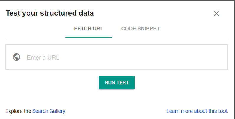
If you want to improve to ensure both your mobile and desktop index have quality structured data, use the Structured Data Testing Tool. Keep in mind that mobile sites should be very specific to the content you share.
#3. Mobile Usability– No mobile index will save you if you do not have a quality user experience. Fortunately, there are a few mobile usability tools to help you ensure your mobile site is easy for users to navigate.
For example, every browser looks a little different. If you want to see what your website looks across the 1500 plus desktop and mobile browsers, you can use CrossBrowserTesting. Then you know how your website works on iPhone and Android devices.
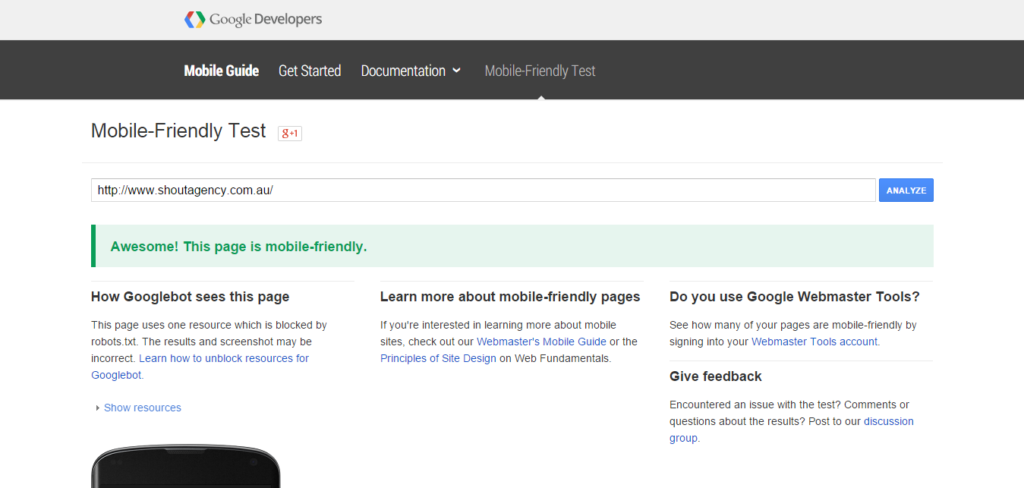
Additionally, you should check that your site is mobile-friendly. Google’s new mobile-friendly test identifies in less than a minute whether your site is mobile-friendly.
#4. Page Speed– Your website page speed is an important component of your search traffic. It is even more important to mobile devices that usually load a bit slower.
Therefore, you should start by using tools like Google AMP to load larger sites much faster on mobile devices. The average site load speed is 8 seconds. However, Google AMP is half a second.
Next review the Google Search Console to ensure you minimized elements on your site that would load slower on a mobile device. You can use the Page Speed Insights to determine what you need to fix first.

#5. Avoid duplicate content- The canonical link in a website is the link that identifies the site to the search engine. Therefore, when you have a mobile and desktop version of your website, you need canonical links that identify to Google the differences between the desktop and mobile version.
Duplicate content can kill your search traffic. With the mobile-first index, this is a bigger issue. Each mobile and desktop page look like different pages to Google. However, they both have the same content.
Avoid this problem by using the right canonical links that separate the two pages.
Final Thoughts
Mobile-First indexing will not change what you need to complete to generate search traffic. Instead, it is another reminds that you need to consider how your mobile visitors interact with the content on your website.
The more you can transform the experiences you created on your desktop to a mobile experience, the more you can generate mobile search traffic.
If you need help with how to use mobile-first indexing work for your business, schedule a free consultation with one of our search engine experts today!


