Overview
For years, marketers stated that mobile marketing would be the next, hot new trend. Well, for those who have not been paying attention to the new mobile algorithm change from Google, the truth is mobile marketing is here.
For many relying upon search traffic from Google, mobile SEO is a vital part of the process.
It should not surprise anyone then that mobile searches are overtaking desktop searches. Along with that is the rise of mobile ecommerce.
Right now, 41% of all millennials purchase items from their mobile phone.
Therefore, Google is taking huge strides to ensure their audience only see websites that are optimised for mobile and tablet devices, not just desktops.
If your website is one of the industries which now receive 50% or more of their website traffic from mobile devices, you need to be prepared. However, the case can still be made that certain industries do not need to optimise their site for mobile traffic immediately. Take Search Engine stalwart Moz.Com.
In a recent post from founder Rand Fishkin, he stated how the vast majority of Moz’s traffic comes from desktop traffic. In fact, 83.89% of the Moz Blog is desktop traffic. Just like Moz determined the impact of their mobile traffic, you need to determine how much of your traffic comes from mobile search as well. Additional, how will the new algorithm impacts your ability to drive quality traffic to your site. That is what we look at below.
What effect does the mobile Google algorithm have on my website?
Before you panic about the effects of the new updates to your website, check two things first:
1. Your website mobile configuration
2. Your Google Analytics traffic.
First, test out your current website to see if you have a mobile or responsive version. Here is a simple trick you can use on your web browser to determine your websites responsive design:
– Go to any page on your website. Then at the top of the browser, click the middle square box at the top right of either Chrome or Firefox. It should make your browser smaller, but not close or minimize the browser.
See if your website has a horizontal scroll bar at the bottom of the page. If it does, then your site is not optimised for mobile traffic. If you do not see the horizontal scroll bar, then slowly enlarge or shrink the browser size. Does the content move on the page, according to the size of the browser? If it does, then your browser is mobile responsive.
Second, take a look at your Google Analytics Mobile overview to determine what percent of your traffic currently comes from mobile devices. If the amount is negligible then you should not be in a rush to make your site mobile friendly.
Estimating Your Mobile Search Traffic:
What happens, however, if you notice that a sizeable portion of your traffic comes from mobile and tablets to your non-responsive website? How much will it influence your traffic? To estimate your mobile search traffic, follow these steps.
First, check out your top keywords on Google Webmaster Tools. Webmaster Tools can help you determine your top 10-20 non-branded keywords for your site.
For example, if your site is Shout Web, then “Shout” and “Shout Web” should be excluded from this list. However, keywords like “Search Engine Optimisation” or “Pay per Click Advertising” should be included. On webmaster tools, find the number of search queries for your top keywords on your list, along with their average ranking.
Second, use the Google Ads Keyword Planner to determine each keywords traffic trends. While this is not an exact match, you can estimate your traffic losses before the April 21st algorithm change by Google. For example, let’s look at the keyword “digital marketing agency” in Australia. We can get a feel for the search volume trends of this keyword to determine the total traffic to all sites on Google from this keyword.
Understanding the general trends will help us get rough numbers later when we understand what position our site will be in on mobile searches after the algorithm change.
Third, use SEMRush to determine your positions for your mobile keyword positions. By using SEMRush and Google Webmaster Tools, you compare your keyword positions on organic versus your mobile organic keyword positioning.
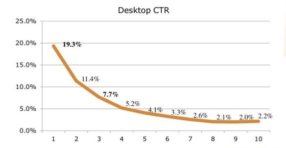
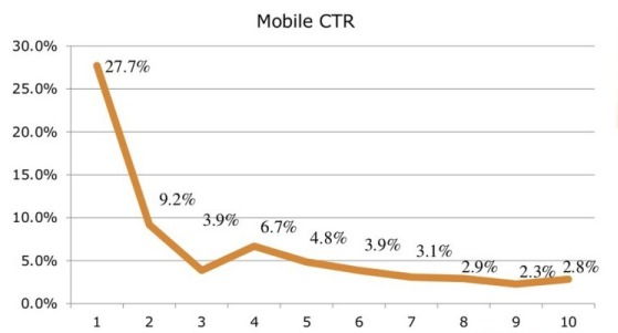
Fourth, combine your mobile search research into one spreadsheet. Using the categories listed in the spreadsheet below to highlight the differences in the click-through ratios between the Desktop and Mobile searches. As you can see from the graphs below, first place position for a keyword on a desktop has a lower click-through ratio (19.3%) compared to a mobile click-through ration (27.7%):
Looking back at the example of Moz.com we used above, here is a sample spreadsheet of how their site would be affected by the algorithm change.
They could still lose 3% of their total web traffic to their site, even though they do not receive a large portion of their traffic from mobile. For a website that receives hundreds of thousands of visitors every month, this could be a big problem. If this were a site that had a significant mobile presence, it could be disastrous. The reason for this is simple. Many sites like Moz have lower rankings on mobile searches. This trend will accelerate after April. By calculating the problem now, you have a better understanding of how to fix it over the next month.
Final Thoughts
In conclusion, Google’s mobile algorithm update serves as a wake-up call for businesses to prioritize mobile optimization. By embracing mobile-friendly design, optimizing page load speed, and enhancing mobile usability, you can not only improve your search engine rankings but also provide a seamless browsing experience for your mobile audience. The impending mobile deadline set by Google underscores the urgency for action.
The Google Mobile search algorithm change has been in the works for years. As more and more of the general population around the world use their smartphones and other wireless devices, it only makes sense to have a mobile website strategy. That is why for the past year or two, any developer worth their salt installed mobile responsive themes to help small businesses cope with this rising demand. However, many sites that have not been updated recently are at risk.
Don’t wait until it’s too late – take proactive steps today to ensure your website is mobile-ready and stay ahead in the competitive digital landscape. Remember, a mobile-friendly website is not just an option; it’s a necessity for success in the mobile-driven world.
If you need help preparing for the upcoming algorithm changes, give us a Shout today. Unlike many algorithm changes in the past from Google, you have the opportunity to get ahead of the changes to your search traffic.


